Trends in Lighting

We are creatures of change, always looking for the next thing to inspire and excite us. As a reaction to recent events, it seems we are slowing down – seeking comfort and anchoring ourselves to more meaningful design trends and choices. There is an emphasis on comfort and familiarity combined with slow design and ethically sourced materials. Here, we take a look at some of the emerging trends, or even an overall arching “counter-trend”…
Written by:
Hannah Thompson
Contributors:
Kay Prestney, Kinship Creative Design Consultancy
Instagram: @kinship_creativedc
Julia Thompson, Interior Designer, Frank Interiors
Website: frankinteriors.co.uk
Hannah Simmons, Interior Stylist and Designer
Website: hannahsimmons.com
Hannah, Content Creator, Harnham House
instagram: harnhamhouse
Charlotte Churchill, Master Ceramicist, Lam Lighting
David Lam, Creative Director, Lam Lighting

Our eco-consciousness and sensitivity to the environment are more prevalent than ever before. Just as we are thinking harder about our wardrobes, choosing well-made, quality garments over fast-fashion, the same is true of interiors and what we are putting into our homes. As a society we are moving away from fleeting trends, instead investing in pieces that will last for a lifetime, “buy to last” – in terms of both design aesthetic and physical quality. We are also more curious as to the ‘where and how’ – the origin of materials and the production processes.
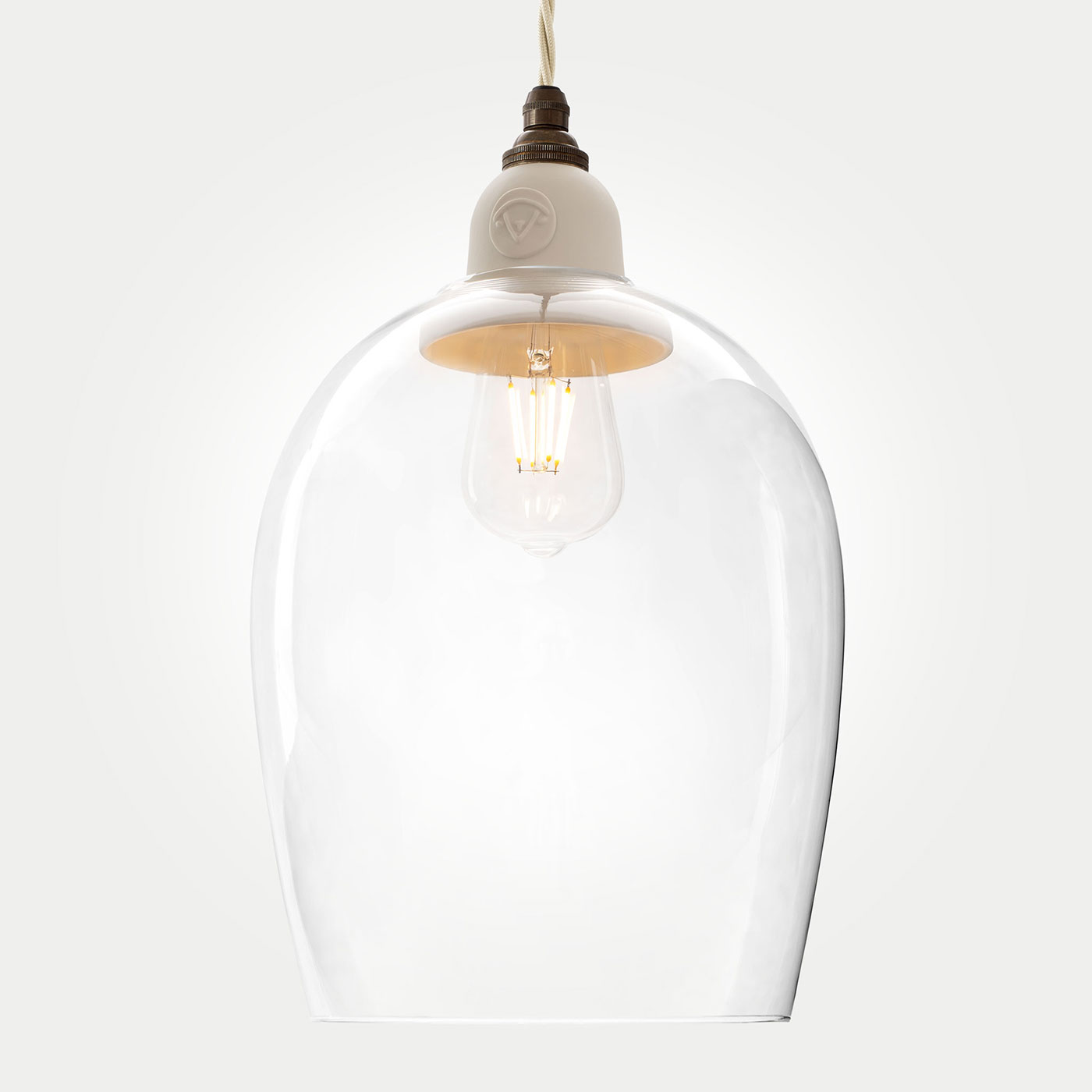
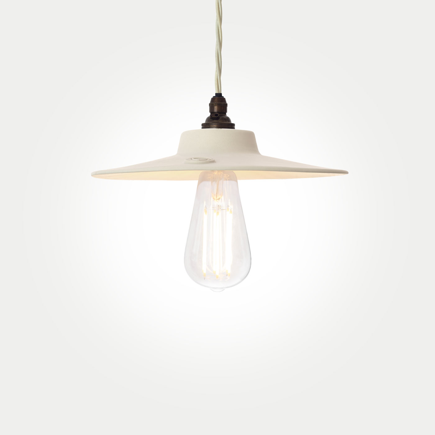
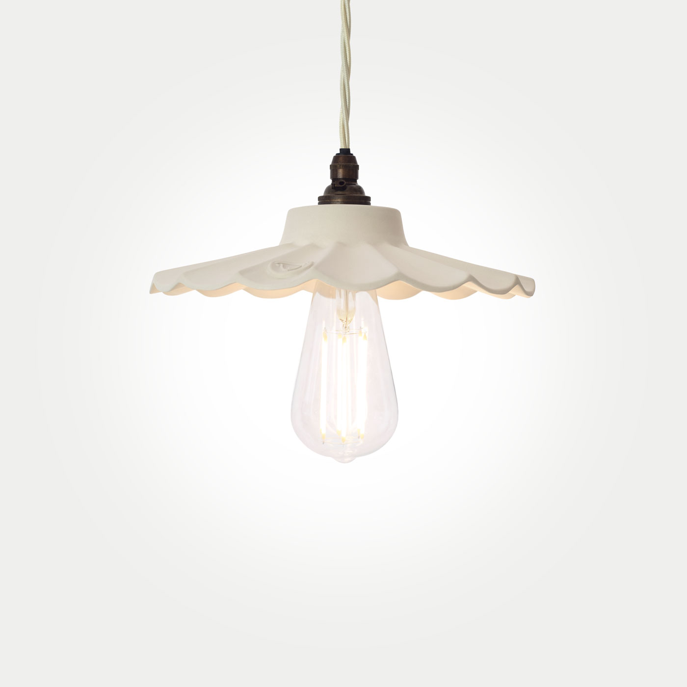
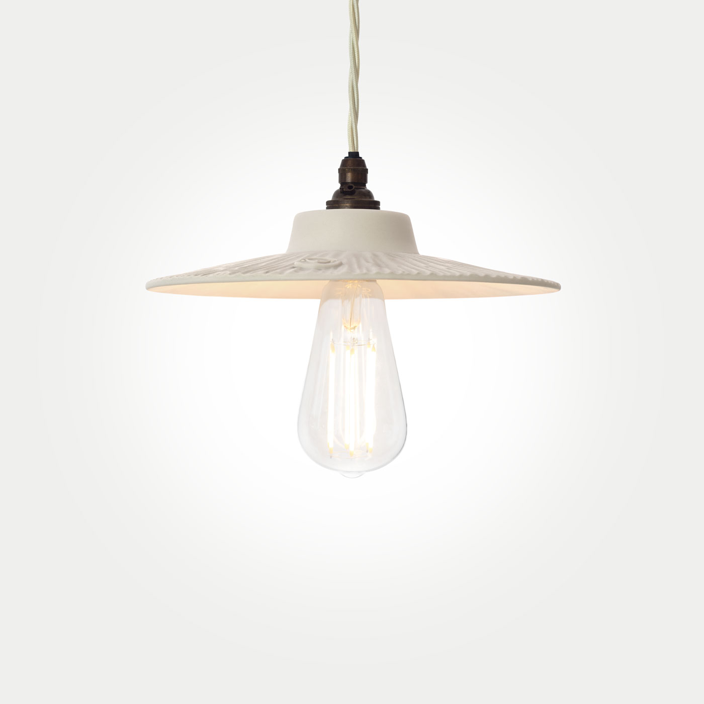
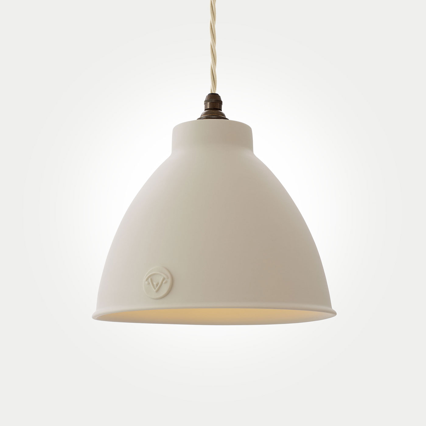
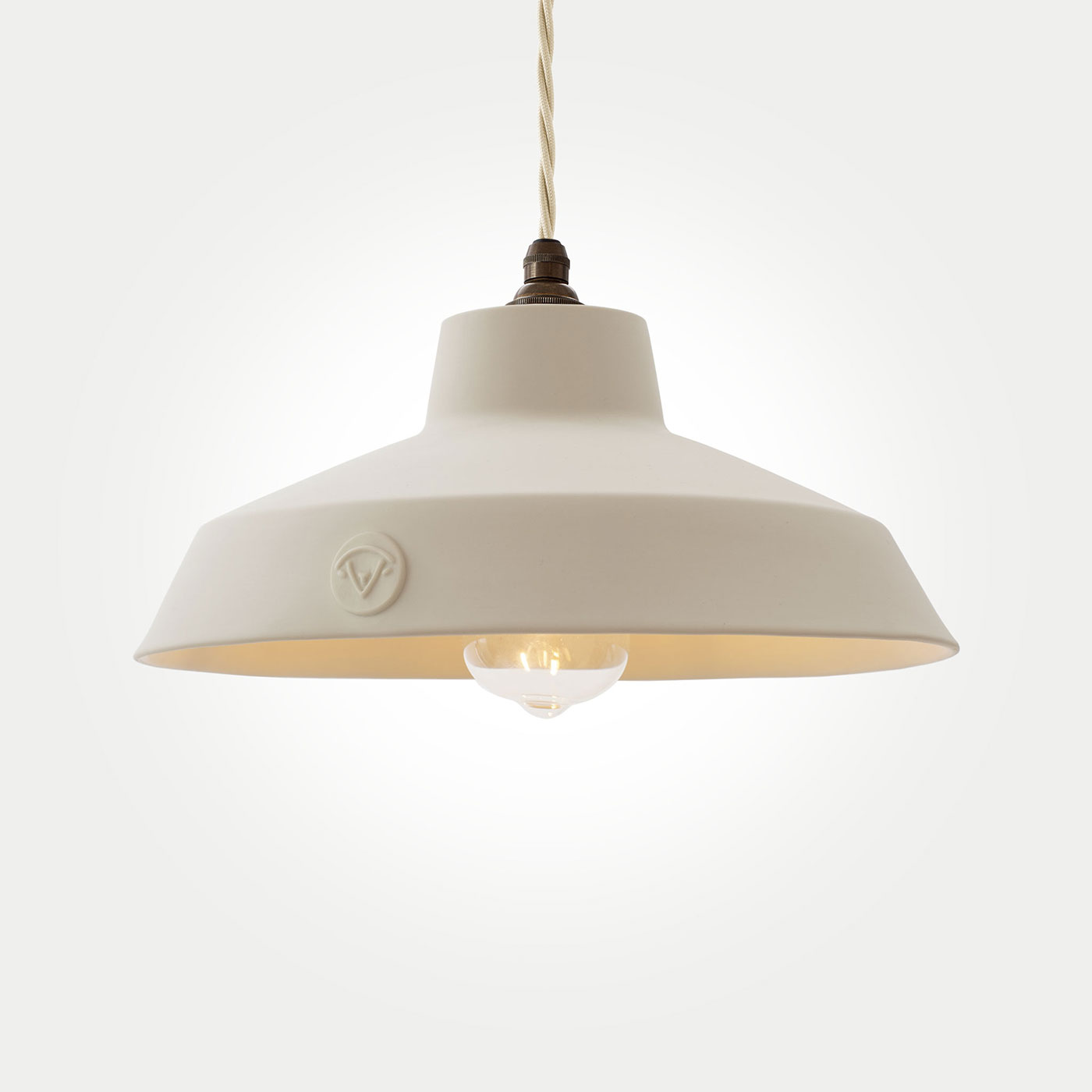
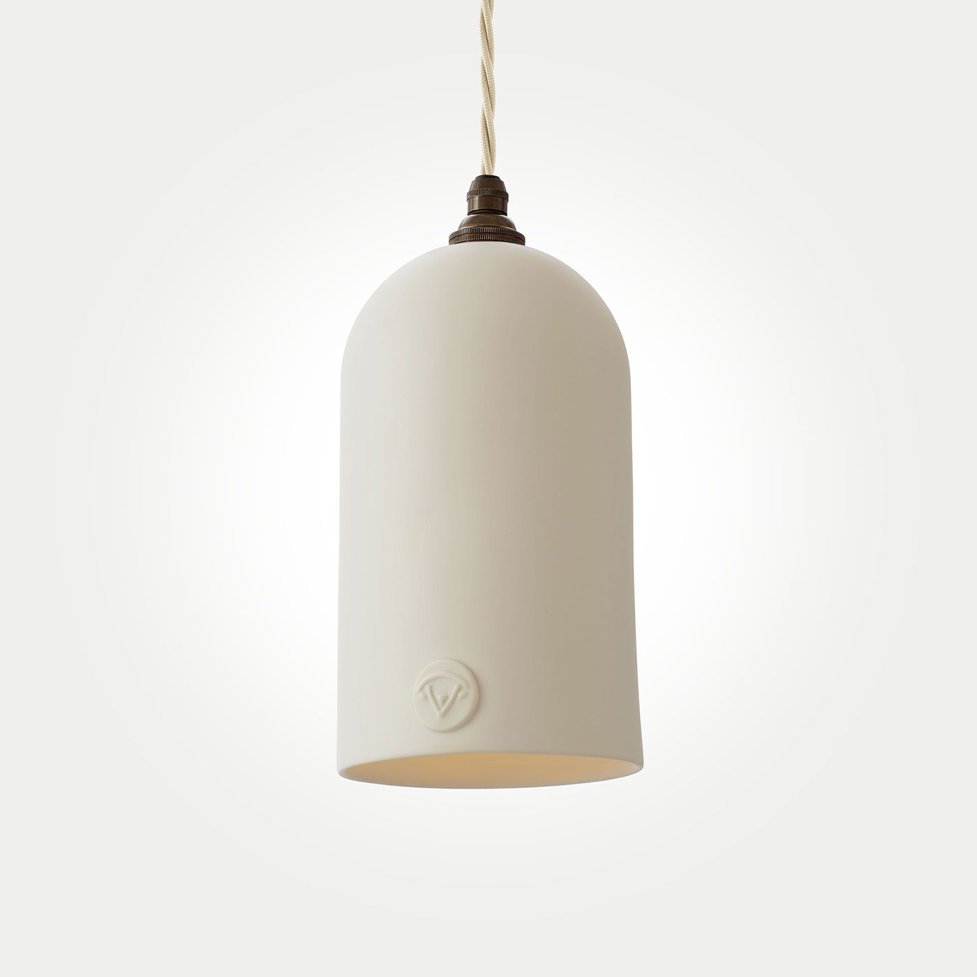
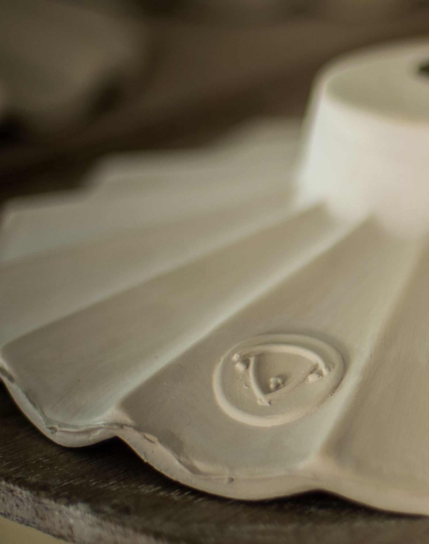
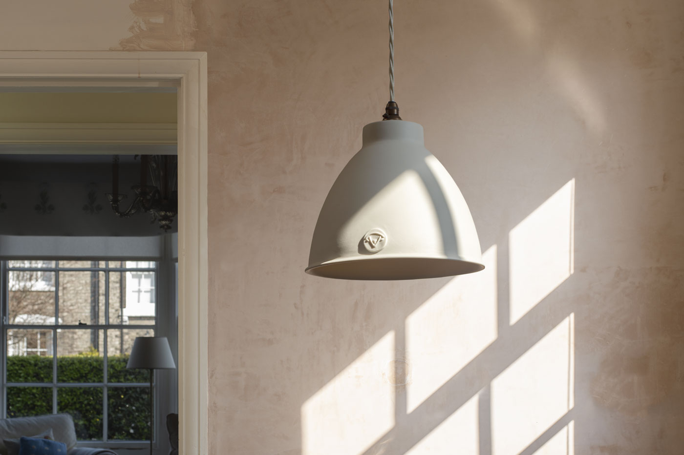
Every natural, raw material has a tactile quality and unique texture; the patina of veins in marble, the grain running through wood, or the gentle tonal changes of rattan and wicker. We handcraft our lights from fine Limoges porcelain, which is widely renowned for its tactility and natural beauty. We love this beautiful material for so many reasons, which is why it is incorporated into every single one of our designs. Along with its inherent luminosity and ability to reflect light so softly, one of its most appealing traits is its longevity. It is dug straight from the ground, and once fired it will not tarnish over time – it will not rust or erode, nor will it distort or dent. It is incredibly tough and its timeless elegance will not fade.
Kay Prestney, Creative Design Consultant says: “I am passionate about using natural materials in my design work and spreading awareness of the benefits to both people and planet of sustainable design. We function better when we have access to nature, it has the power to improve our mental and physical health. Proximity to wood can reduce our heart rate, plants can clean the air of toxins and mimicking patterns such as waves or spirals found in nature relaxes us. Investing in special pieces that are hand-made using natural materials such as clay, linen, wood or stone creates beautiful and timeless interiors that have a tale to tell. This to me is what good design that makes a house a home is all about. I am also a huge fan of getting outside daily, noticing the changing seasons, foraging small pieces to bring back which trigger memories of time in nature and add texture to my home.”
Charlotte Churchill, Master Ceramicist at Lam Lighting, says: “The appeal of porcelain is its timeless style, and the fact that it will last forever. It is delicate and sometimes unforgiving to work with, yet when fired it is strong and everlasting. This idea of longevity is echoed in the traditional craft-making process. It is an ancient skill that has been developed over centuries, and every individually handmade piece is an evolution of the story.”
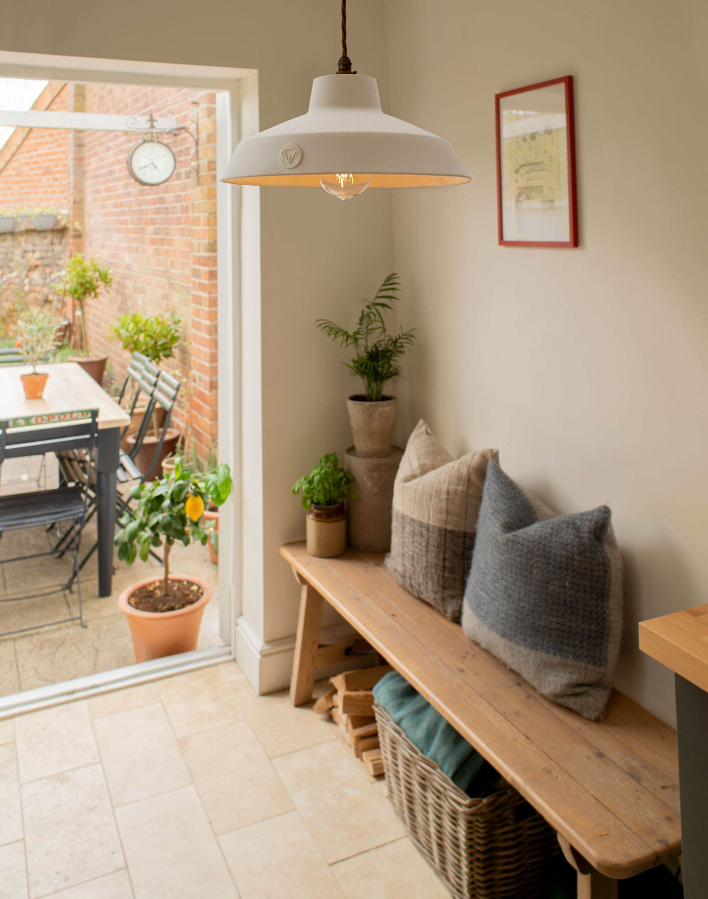

Earthy and sunset tones are very much the colours of the moment when it comes to interiors. Think of a palette of natural materials such as stone and clay. The blazing yellows and vibrant reds of a beautiful sunset and a warm palette of pinks to promote tranquility and healing (Pantone recently announced their Colour of the Year as ‘Viva Magenta’). This is a trend that is undoubtedly linked to our growing interest in sustainability and eco-sensitive design, the colours of nature itself being the ones we are choosing to surround ourselves with.
We recently created a showroom area in the front of our workshop building. I was tasked with finding the colour scheme for this new public space. Our porcelain has such a beautiful and delicate tone, whatever colours we chose had to complement it perfectly. In the end, we chose Setting Plaster by Farrow & Ball for the upper half of the walls and Gateway Arch by Valspar for the wooden panelling. Clay is a natural material that comes directly from the earth, and so sticking to earthy tones created an overall harmonious palette of natural hues. There is a wonderful air of calm when you walk into the showroom – the glow of the lights brings out the warm tones of the colours beautifully, and the purity of the porcelain is showcased just as we’d hoped.
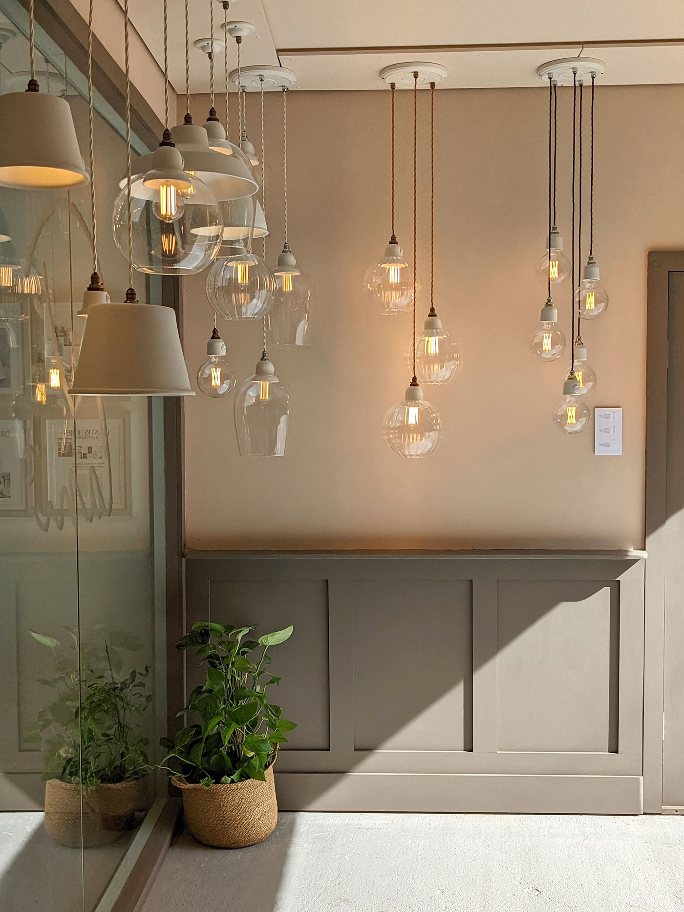
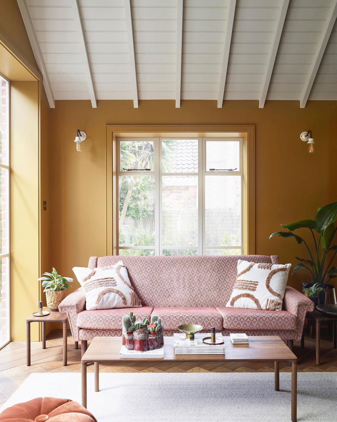
Interior Design by Julia Thompson, Frank Interiors
Photography by Mary Wadsworth
‘I recently used a stunning mustard ‘sunset’ shade in one of my projects, Golden Honey by Sanderson; it was a bold choice, and I will be forever grateful to my brave clients for trusting me to use it. The colour brought so much to the scheme; it is such a positive shade that brings sunshine into your life, something I think most of us need right now. Even though it comes under the yellow colour spectrum, mustard is far easier to use than many of its acid-yellow counterparts; it is soft and earthy, and such an adaptable shade. It works beautifully against wood, and in this particular scheme I used a parquet oak floor and bespoke oak shelving, and wow, when blended together these tones just sing. Throw in some greenery in the way of a few plants, and, for me, you’ve created the perfect colour palette.’

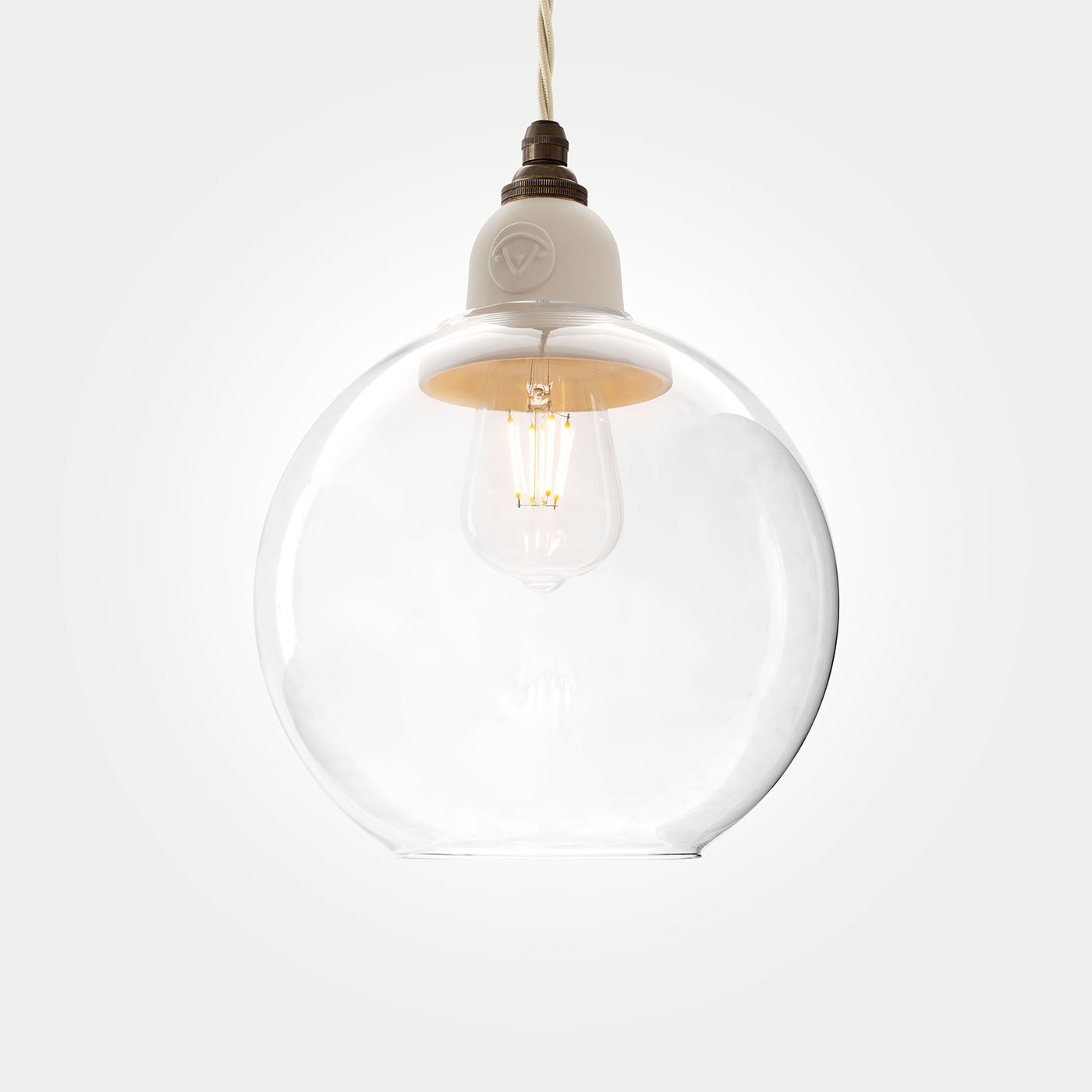
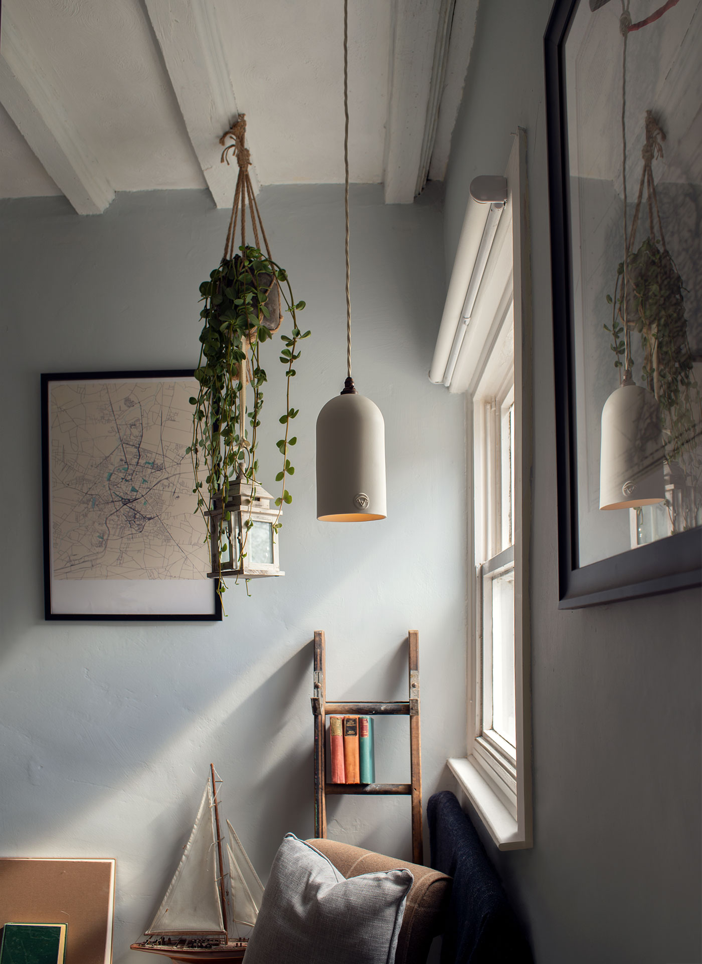
The use of curves in interiors is increasing in popularity, and now it is set to become even more so. By choosing furniture and accessories with rounded edges, organically-inspired shapes, sleek arcs and curved flutes, we are opting to bring softness and comfort to our homes. By replacing rigid, geometric lines and sharp corners with graceful curves and soft silhouettes, it will allow a space to naturally flow, to become a sanctuary of comfort. It is also a trend that crosses over into other current and emerging design philosophies – Biophilic and Retrospective….
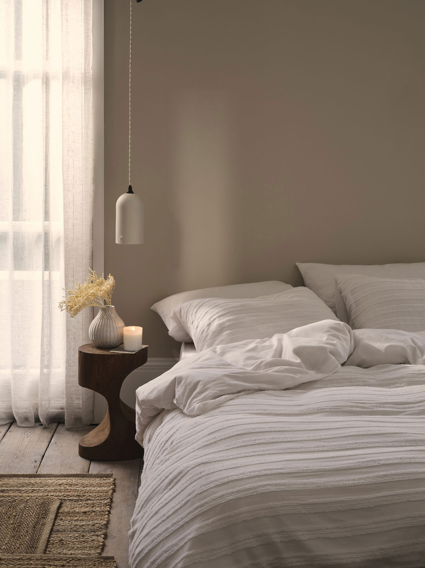
Interior Styling by Hannah Simmons
Photography by Simon Bevan
In the 1970’s, furniture designers increasingly favoured soft, curved silhouettes over the hard, sharp lines that had dominated the 50’s and 60’s trends. This resulted in comforting, inviting spaces that were more conformed to a mid-century, modern aesthetic.
Hannah Simmons, Interior Stylist & Designer, says:
“By introducing curves into your interiors you can soften the vertical structure of the room and create visual tactility. Their organic shape immediately calms the room dynamic and adds a gentle tranquility. A round mirror, a circular coffee table, and a simple curved pendant light can help create this impactful yet simple balance to the space.”

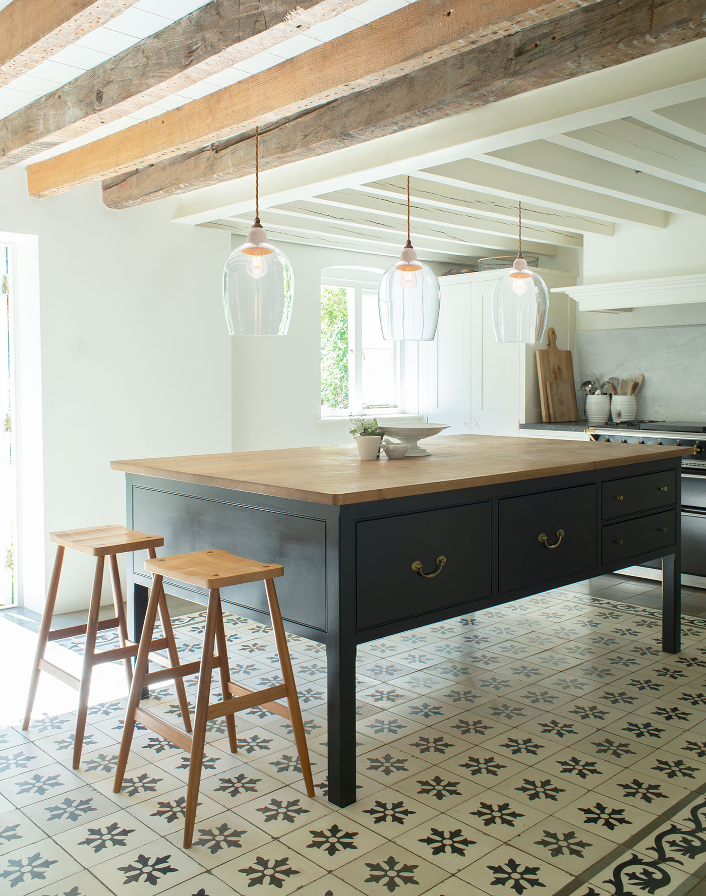
Layering light creates depth and interest while illuminating a space, it also allows us to adapt the mood of a room to suit the occasion. Pendants can be used in a variety of styles at different heights to highlight the dimensions of a room, creating overlapping pools of light that vary in scale, creating a somewhat dappled effect. Multi-Pendants are also a wonderful way to accentuate the verticals of a space, using cascading tiers of light to create a beautiful focal point. Wall lights can be used not only as a decorative feature, but to wash the perimeters of a room with a soft and delicate glow.
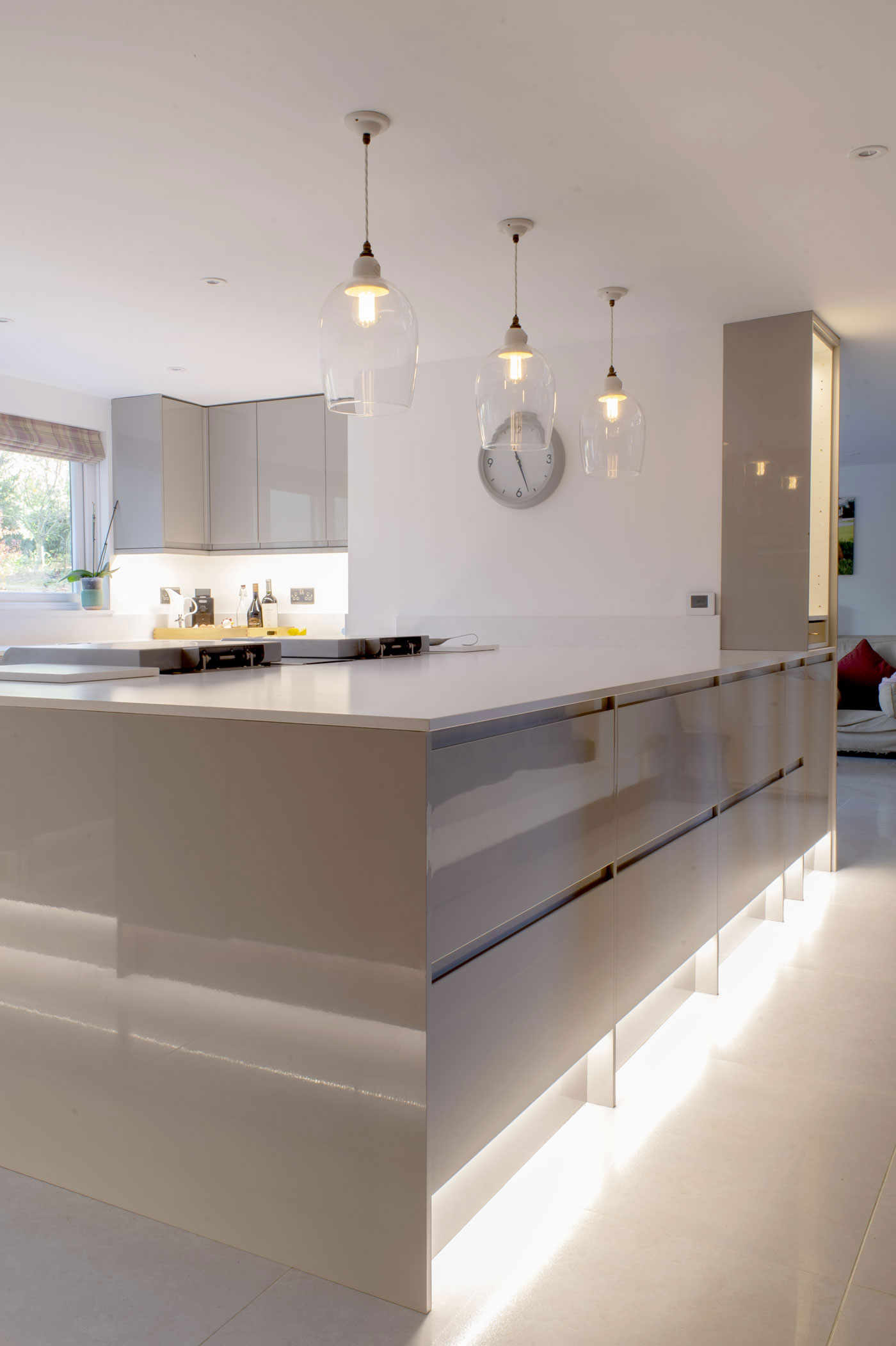
David Lam, Creative Director at Lam Lighting, comments:
“Interiors are becoming more sympathetic, humanistic, and even naturalistic. With a growing spotlight on mindfulness and wellbeing, we are looking more closely at sensory interior design. Layering lights through the dimensions of a room with multiple dimmable pendants, well-situated task lights and wall lights make a space adaptable to the time of day and the mood of a moment.”
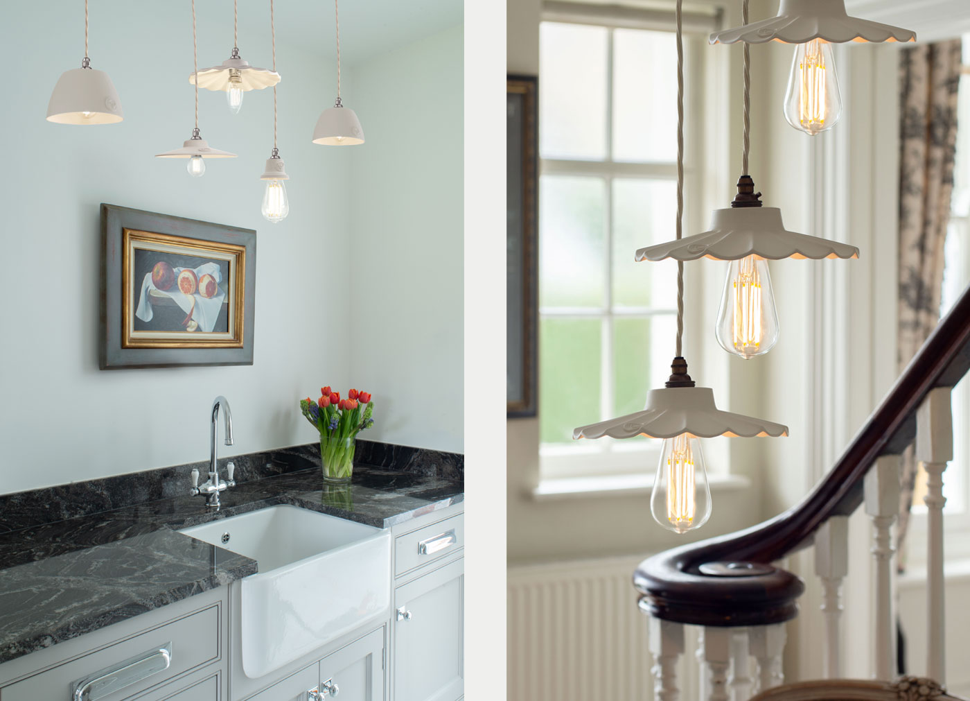
David continues:
“There’s no need to complicate it, I’ll always consider these 4 questions for any room:
1. For a background-layer, would the room benefit from wall lights?
2. For a mid-layer, where could task-lights enhance the room? Whether it be a plug-in pendant or wall light, a floor lamp or desk/table lamp?
3. For a texture layer, could feature lights enhance the room? Where the light itself can serve as a sculptural point of interest.
4. For a front layer, i.e. the main pendants in a room, is it a single pendant for smaller rooms or a group in larger rooms, or even multiple groups in different areas in the same room?

We are attracted to the nostalgia of interiors reminiscent of times gone by. We find comfort in details that we hazily recall from our grandparents’ homes or a familiar print that adorns a cushion or curtain. There is something about the familiarity and affectionate associations of this trend that makes us revisit it time and again. So much so, that this time it’s even been coined ‘Newstalgia’. The pairing of vintage or handed-down pieces with contemporary furniture, or presenting retro features in a modern way. It is all about curating a space with personality, that tells a story.
Julia Thompson, Interior Designer at Frank Interiors, says:
“I have always been a great lover of anything vintage or retro inspired, and my schemes are always full of vintage finds that all have their own story and soul. I find that by using old pieces, a scheme can never be replicated because the end result is always truly individual and unique. I adore a Seventies colour palette, full of earthy yellows and browns, and my inspiration for this project came from an image of a kitchen I found featuring some fabulous retro inspired tiles. I found this wallpaper from Little Greene which had the same Seventies colour palette. Combined with an Oxblood red and mustard walls, the end result is striking.”
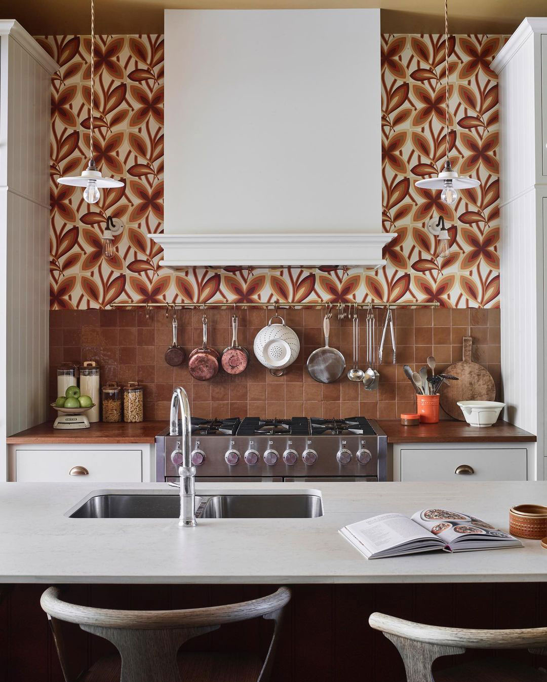
Interior Design by Julia Thompson, Frank Interiors
Photography by Mary Wadsworth
Hannah, Content Creator, Harnham House, comments:
“So many pieces in our home are inspired by the past, whether that be through furniture, paint colours or home accessories. Using nostalgic pieces in your home decor makes it feel more cosy, unique and warm. No matter what house I move to – whether it be a new build, 1950’s or an old thatch – I will always carry elements of the past to decorate my home.”
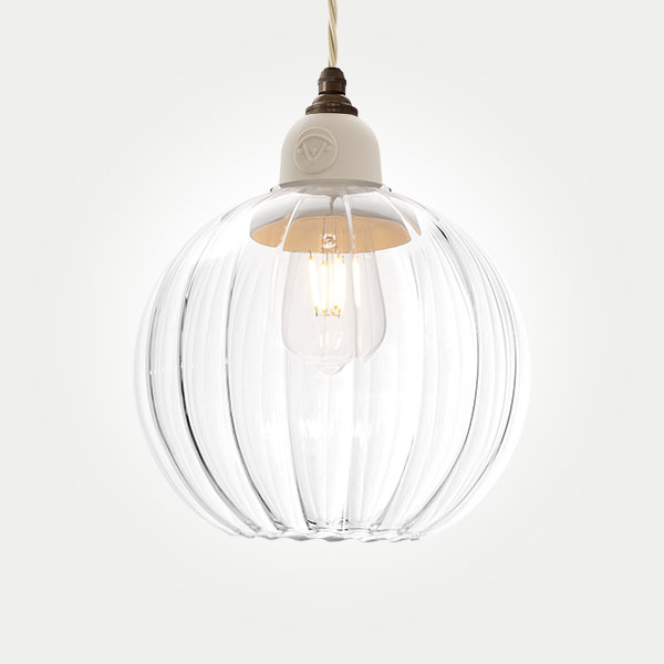
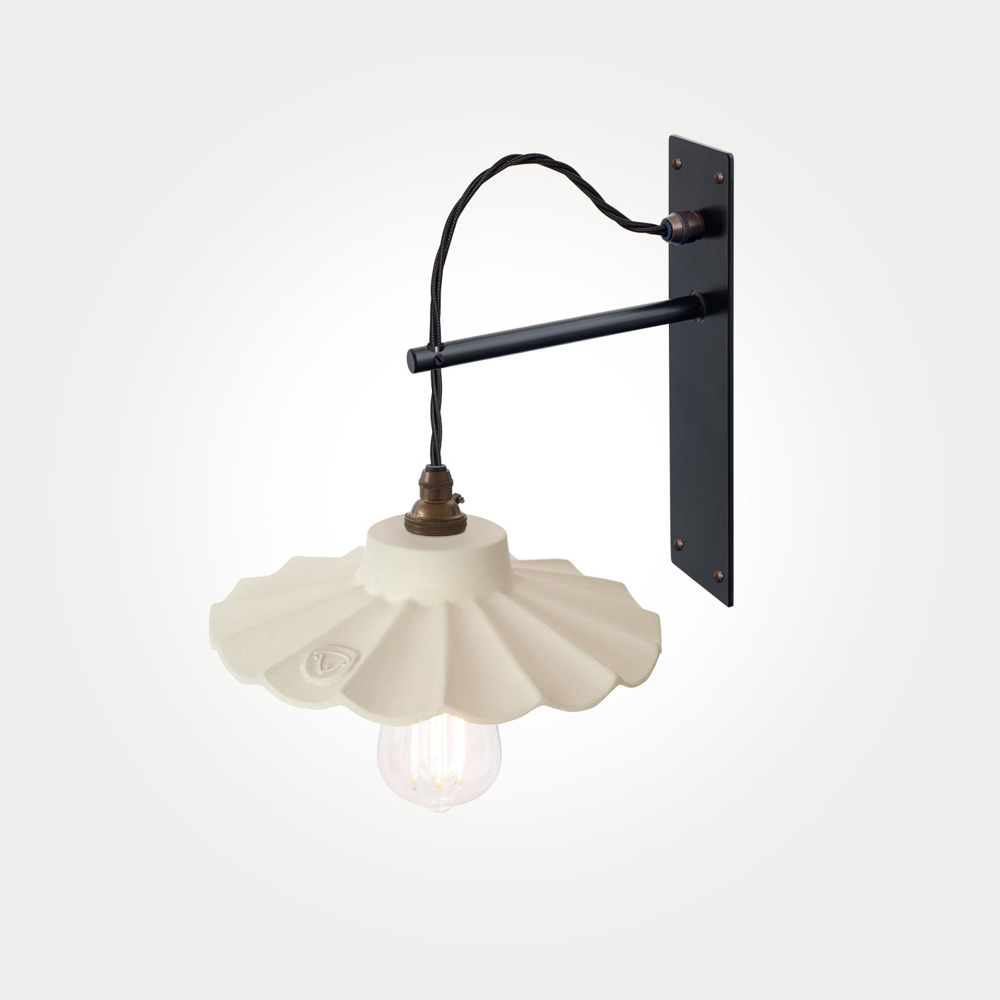
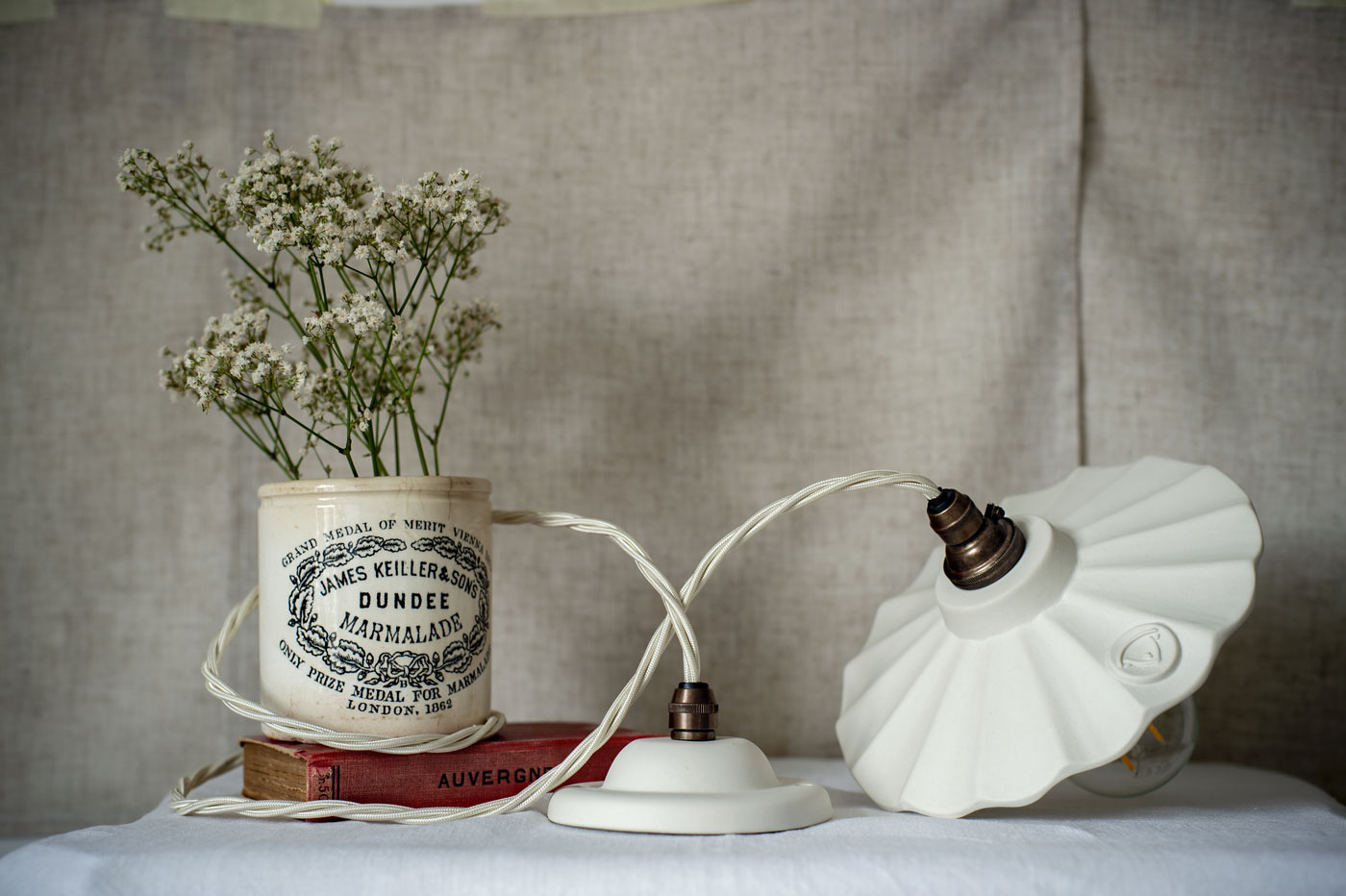
While remaining timeless, many of our lights are vintage-inspired, with silhouettes that echo and channel antique styles. The fluted glass of the Millais pendant is reminiscent of the Art Deco era of the 1920’s and 30’s. Whilst the Giselle is inspired by the classic form of a ballerina’s tutu, it also nods to a popular ‘ruffled’ lighting style from the early 1900’s.
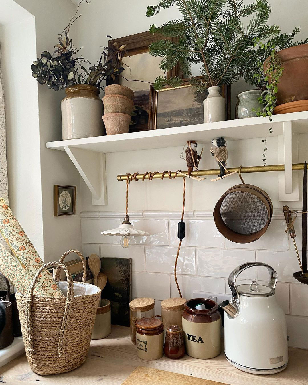
Image & Styling by Hannah at Harnham House
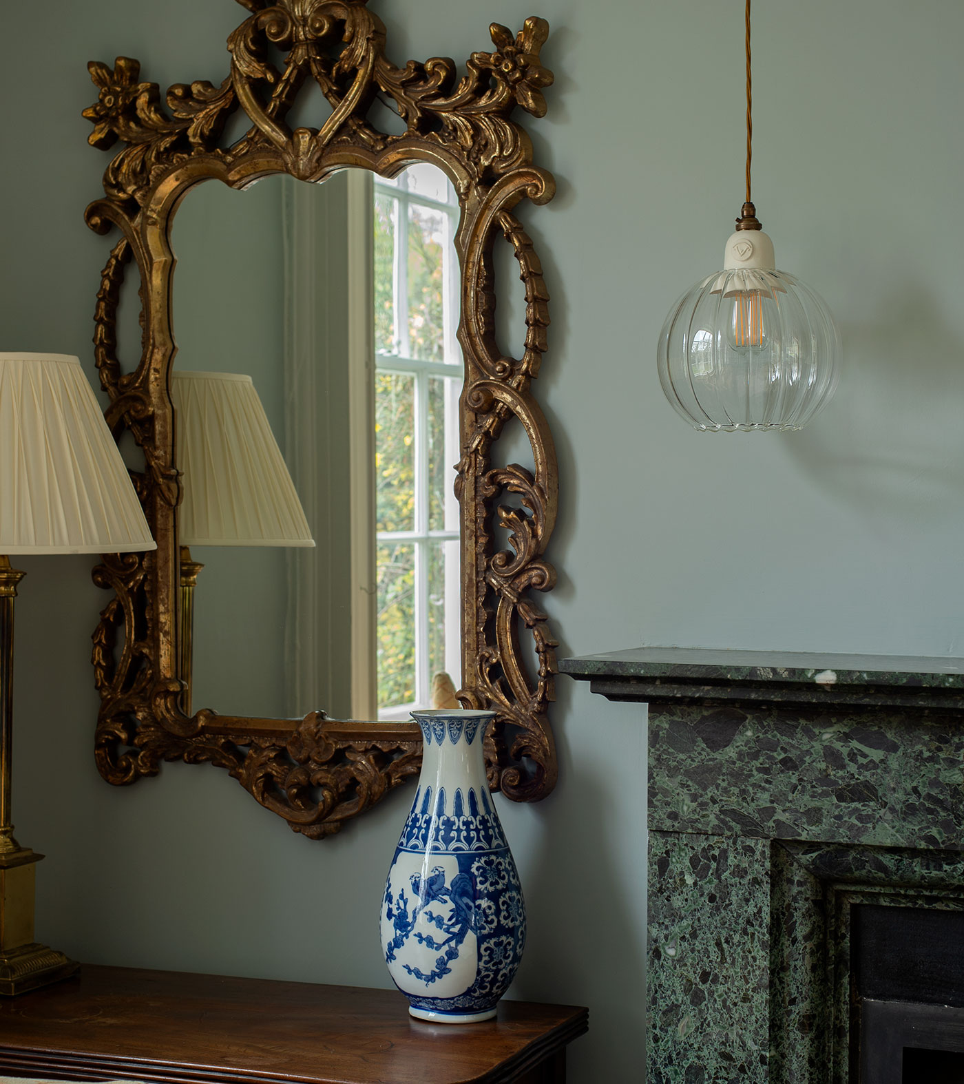
The very meaning of the word “trend” suggests the rapid change of styles and interests. However, perhaps this new wave of thinking is more of a counter-trend. A trend of longevity is a contradiction in terms but nonetheless a positive look towards a more sustainable future.

